Wednesday 21 December 2016

Practical breakdown

The reasonings behind each page of my practical book - illustrations and writings:
The book is influenced by the two theories from my essay:

1) The uncanny - blow up dolls are similar to us in human likeness, not being able to distinguish whether it's a human or not feels us with dread - this sensation is the uncanny
2) Hybrid Consumption - The amount of activities that shopping centres provide to make you consume.


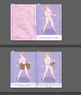
> Use of space - each illustration of the blow up doll was made smaller to emphasise on the idea of space. Seeing as space is the main focus of my essay, I thought i'd miss a trick if I didn't include it in the practical piece. 
Single person - Susan stands alone in each image, this represents what is said in Buchanan's analysis of Marc Auge's writings of the self/individualism (SUPERMODERNITY - Ego). "Anthropology now chants the lonely song of the self" (Buchanan) - everything is now about us and it's like this now than ever before. 
>Non-places deal only with individuals, alone but one of many (Augé 1995). The figures in these drawing are usually singular. They are alluded to in shadows. Even when these figures are observed in groups they seem silent. There is no engagement. There is no eye contact. - Rachel Gannon on non places

> The writing - "Susan has no specific motive whilst at the mall." - this piece of writing comes from my case study. In my findings I saw that most of my participants would go to the shopping centre without having any motive 
"Susan just wants to look popular." - this again comes from my case study, as one of my participants said that she would share her location so people she knows can see that she's there. It's also from Walter's concept of the flaneur, the idea that we just want to be seen shopping. 


> The writing - ‘one alluring shop after another’ - Ritzer 1998 quote - backs up that shopping centres are laid out with a purpose (this being to spend the most money as possible) nothing is done at random.


> The writing - "towards a familiar chain" - familiarity is something that needed to be included in the practical. Says in Buchanan's writing about familiarity - "and as every overseas traveller knows, the familiarity of even so soulless a generic space as an airport can be comforting." This is something that people search for, as unfamiliarity is something that scares us. I found this in my case study, as some participants said that they visit the same shops when at the shopping centre because they like to stick to what they know.  So I also included a brand that is universally known in the illustration as well as the writing. 
> Use of food stalls - that people spend more money if theyre not feeling overcrowded (Bryman, 2004).


> Familiarity - in writing and image - tango ice blast - brand familiarity (reasoning same as above for familiarity) 


> Just another element of hybrid consumption that may not seem as obvious to that of a restaurant or a cinema. 


> The writing - importance of layout - nothing is put in a shopping centre at random, it is put in place to insure that the consumer stays there for as long as possible - stay longer theory. Thus having more opportunities for consumption near exits to entice you before you leave. This was seen first hand in Bluewater shopping centre, as they have a mini arcade by the exit to the carpark. 


> The writing - reference to the excess of time - supermodernity 

> The writing - Themed restaurants - from my case study, a participant said that they would rather go to the Trafford Centre restaurants because they are themed because it makes it a more fun and enjoyable experience. - when people feel good they tend to want to stay longer” (Bryman, 2004).

>where the book gets more serious<

> The writing - Again, reference to excess of time - supermodernity

> The writing - relates to my introduction of my essay - "Clouded within the milieu of the signs and symbols of the realities that the consumer must decipher, the hyper-real is often overlooked, illustrating the success of hyperreality and the difficulty that consumer citizens encounter in differentiating between the two (Koutsobinas, 2015)."

> The writing - "susan doesn't need to spend this much time..." - the message I want to get across/the purpose of my practical - to make people realise their spending habits and how they don't need to be swept under all these different consumption 'opportunities'.


Cited from essay - Cities have been built with consumerism at the forefront, making it completely unavoidable, even if one has no interest, you consume (Buchanan, 1999).
Cited from essay - "But by combining different elements of consumption, hybrid consumption changes the way in which you perceive your surroundings, that being something spectacular(Bryman, 2004). As Bryman discloses, by doing this they create extraordinaries where otherwise ordinariness reigns.’"
>Single sentence at the end reiterates point of the book - you don't need to spend all your money and time in a shopping centre. 


Friday 16 December 2016

Clothes made from used blow up dolls


I found this on bored panda when looking to see if there was any illustrations of blow up dolls, I thought it would be a bit of a stab in the dark but went looking anyway. I didn't find illustrations, but found a dutch artist called Sander Reijgers who made a fashion collection using used blow up dolls donated by a 'sender'... 

“These dolls are so ugly and vulgar that turning them into something beautiful has become a challenge for me. The doll is a means to convey something else… it’s near-incomprehensible that people could have sex with something as ugly and lifeless as a blow-up doll. However much air you pump into it, it remains an object that can’t reciprocate the feelings of lust…” - Sander

I really like what the artist has said about his work. It is quite relevant to what I've been talking about in my essay, about transformation of one thing to another, but overall it's still just quite a mundane thing. I really like this concept contextually, like how you can dress something up as much as you want, but it still can't do what you want it to do. This is something I want to think about in the future.


Friday 9 December 2016

Practical printed - but...


Although I have a print slot booked for the 10th Jan, I had already finished my book so I wanted to just go to drop in and get it printed so it didn't have to hang over me during christmas. I printed two books, because I knew I was going to mess one up. 

Mistake 1 - I accidentally wrote Sandra Bollock instead of Sandra Bullock... an easy mistake I suppose, and I could say that it's meant to add to the humour... but I can't have this in my final book. 

Mistake 2 - I attempted to staple one of the books and it just made an absolute mess of the spine, so that's definitely not getting submitted as my final book.

Mistake 3 - The other book should have been put together perfectly in theory, but that would make my life far too easy. I accidentally folded my front cover way off the mark, so there's a crease on the front cover. So that's definitely not getting submitted as my final book. 

Instead of getting annoyed at the £6 I've lost in the printing and the time that I've also now lost... I need to think of this as a positive, because now I know what to avoid and what I need to be more careful of when putting my book together when I have my print slot. But I'm really glad I've allowed myself this time to mess up so when it comes to the final thing I've sorted them already so I don't have to say in my evaluation 'i wish this was different if i had more time' but actually because i did a run through i can redo my mistakes now so hopefully my final product will be better. 

Thursday 8 December 2016

PROTOTYPE


Before I print off my final book, I just did a quick black and white test to make it clearly to me what I need to change in terms of layout - especially how the text looks on the page. I'm really glad I did because I feel like I had rushed the writing and could be formatted better, as well as some lazy wording and grammatical errors... This has made me realise the importance of reading and re reading my work to make sure it's perfect for the final stage of printing and not to rush anything!!

Tuesday 6 December 2016

Excess of Space - Illustration layout rethink


Thinking about applying Marc Auge's concept of supermodernity into my practical, and for this experimentation specifically the excess of space. I wanted space to be something that is highlighted in my practical, as my essay is all about the use of space so makes sense. I think by making Susan smaller, this comes across a lot more, making Susan look like she's in a space instead of taking over the whole composition.  

I'll have to change all my images now, but it didn't take me that long to do so should be no problem as I've allowed myself time for alterations. 


After adjusting all my images to the new format and putting them into InDesign, I think they work far better as compositions. All the space makes the small spot image more impactful which I didn't think would be the case. The feel of space is definitely clearer and comes to your attention a lot more than the doll being larger. I am glad I changed my images and had time to change them!!


Book text - what to say?

Pete made me think in my tutorial today that maybe the text should be serious as the images are satirical, opposite to the ladybird book which has a serious image and satirical text. Also the purpose of my book is to raise awareness of the devices that shopping centres use to make you consume and to not be blinded by them. So i think my book does need to have an element of seriousness, to show that isn't just a joke.


Susan and Marc Auge's Supermodernity - Explained

excess of time, excess of space and excess of ego. 

These are the three characteristic of supermodernity stated by Marc Auge. This can so easily be related to my practical! The amount of different consumption elements that Susan comes across shows the unnecessary excess of time that she spends at the shopping centre enjoying these activities. Excess of space can we shown if I give my images more space, making Susan slightly smaller - this is something I should experiment with. Excess of ego being Susan herself and how she is made in our human likeness. These three characteristic are repetitive and standardized. This is also shown in my book by having every image in the same composition and colour, showing the standardisation of shopping centres, linking to what Underhill says in my essay - ‘Which specific mall we’ll be visiting doesn’t really matter, since the things we’ll see and the lessons we’ll learn apply to all.’ (Underhill, 2004)

Rachel Gannons Reading of Auge - Illustrative reponse

http://www.varoom-mag.com/?p=4817

It's great to actually see someone else's visual representations of the theory that I've been researching, as it has been quite hard to source so far. Her illustrations were a study from Luton airport in London which was interesting for me, (being from London myself) and her interpretation of the place.

Why did I choose this place, this airport? It was because of this very paradox, a place that is both strange and familiar. I was not particularly drawn to the aesthetics of such a place although I have become so. I was interested in documenting these strange yet familiar spaces in which we spend ever increasing amounts of time; shopping malls, hotels, stations and airports. In this sense, the airport was an understandable choice. I hadn’t anticipated the opinions that I am going to present to you today.

I liked this paragraph as it is the same reasoning behind my choice of the study of shopping centres -  a place that is both strange and familiar. Although she isn't drawn to the aesthetics like my essay does, as I discuss the layout and design of the places and how that encourages consumption. Strange yet familiar is what she keeps repeating in this paragraph and within her writings, which reminds me of the uncanny - something I can put in my essay? 

"If a space can be defined as relational, historical and concerned with identity, then a space which cannot be defined as relational, historical or concerned with identity will be a non place (Augé 1995)
AugĂ© argues that these non-places don’t integrate with those that have come before. Instead, they promote these existing places to the status of spectacle or ‘places of memory’. He states that non-spaces are defined by their over-abundance of space and contain excessive information. The way we as travellers or visitors relate to non-spaces are through these instructions for use. The space of a non-place creates neither singular identity nor relations; only solitude and similitude. This definition of non-place gives a reason for those feelings I had when visiting the airport; had I ever been there?"

Good interpretation of Auge's Non-places - easy to comprehend

Marc Augé states that Non-places are a product of supermodernity. He defines supermodernity as an intensification of modernity and an emphasis on the ability of biology and technology to overcome all natural limitations. A profound lack of integration between past and present is caused by an outright repudiation of historical knowledge. The three characteristics of supermodernity as described by Augé are excess of time, excess of space and excess of ego. (Augé 1995)

Marc Auge's Supermodernity


The use of space in this imagery is very well executed. It's made me think of my own practical and composition that I need to consider. I need to think about the space around my image - negative space? Make my main image smaller? I should have an experiment on photoshop and see if this would work for my images.  

Saturday 3 December 2016

Extra Ephemera

I was going to do two books for my final outcome, but now as I've changed the amount of pages to twenty, I feel like that this a reasonable amount for just one book and that I should do something else instead to go with the book. From the feedback group session on Monday, I was told to do a dress up doll activity pack that could go with the book. I think that this is will work well with my book, adding another element for consumer opportunity - JUST like what my essay is all about.

So I'm going to make a dress up doll to go with the book using the same elements from the book to match.


Back Cover


I had already decided that I was going to put my other fictional books from my series on the back to make it look more like they're part of a set, with the joke at the end of the series that Susan has no more money because she's spent it all at the mall, theme park and casino. 

I then thought it might be a good link to use two of my key theorists as the reviewers of my book, giving enthusiastic responses. This humour will be similar to the text inside of the book, tying everything together.  

Cover designs


I struggled a little with the choice of type for my cover. I really wanted it to look professional like it actually could be in a shop display. I didn't want to use the same type as I did for my book last year because I'm not producing the same thing. I also wanted to explore my knowledge for type, which is a bit of a frustrating process because in the real world it would be a graphic designer that would do this for me, but I suppose it's good to get at least a grasp for it. I went for quite simple type faces, and knew that I wanted it to be in all caps to be more impactful. 

The choice of having the same image on the cover is not due to laziness. Because all the pages are also the same it adds to the dull repetitive nature of the shopping centre. Having the blow up doll on the front is also intriguing for the audience, making them want to see what the book is all about. 

I think I'm going to go with the cover with my name on it, I think my name at the bottom balances out the composition, otherwise I think it's a bit top heavy. 

(Typeface: Kohinoor Devanagari)

Page decisions


This was my initial idea for the page layout of my book, but when I put it on InDesign I thought it looked too crowded and messy. So I've had to expand my book from a 12 page to a 20 page, which sounds like a huge jump but it's just more spread out. So instead of having text squeezed in at the bottom, it will be nicely spaced out next to the image. I think it'll look better as a double page spread too, with the full illustration and then the white background with text, the contrast will work together nicely. 

Now I just need to work out what I want to say then the book will be complete! Hopefully I will be able to go to drop in next week and get it printed off before Christmas so I can relax a little. 


Friday 2 December 2016

Type?


I found this book cover when looking at satirical front covers beforehand and I think this type would work well for my front cover. This is because I want it clear and simple - no distractions, nothing fancy. But I can't find this specific typeface so I'm going to have to find as close as I can to this. 

Book front cover?


I did a general google search to see what satire book covers there are and the usual approach for them. I've now realised that they usually go for a realistic style, using irony as satire. This worked great for my book last year, but it really won't work with my illustrations I've done now. I suppose this isn't necessarily a bad thing, because I'd rather my book cover stand out against the rest in it's genre instead of just doing the same as everyone else...


...But I've had a thought of just doing a close up of Susan's face, a bit like Joan Cornella's covers. I initially was thinking the shopping centre should be at the front, but now I'm thinking that people would be more inclined to open the book if they see a close up of a blow up doll and be intrigued to see what's inside. I'm also thinking of having the type quite large on the front, so it should be easy enough to see what's inside. 

'Susan Goes to the Mall' - Illustrations


Tom Wesselmann.. Again


Although I have already looked at Tom Wesselmann, I needed inspiration for the pages of my book. I know I wanted to have a massive space around my subject matter but I wasn't sure if it was a good idea or if it was even really done by that many people. 
But i remembered before when I looked at Tom Wesselmann's work that he plays with composition a lot in his work, so I went back on google images to see if anything would jump out at me.
Obviously this image jumps out for very obvious reasons... But I really like how it's just an image in the middle of the page. This has inspired me for the pages and composition for my own book, and now i think i have a bit more confidence in the plain background! 


Book Mock Up/2


I made a slightly better mock up of my book with my final images to give myself a clearer idea of what it will look like when it's properly done. The illustrations will be full page with text in a white box at the bottom, but I wasn't sure on what size was appropriate when printing so the images are a lot smaller than what they should be. 


I'm happy with how my page layout will be, but I still need to sort out the front and back cover and experiment with type and what I'm going to write. But I feel like I'm nicely on track and this book will be completed by the weekend so I think I will go to print drop in and print it off early so I can feel relaxed for christmas. I have a print slot for the 10th Jan, but I don't like how close it is to the hand in, so if I have everything ready for next week I might as well try my luck in the drop ins and can create something else extra for my print slot like stickers??