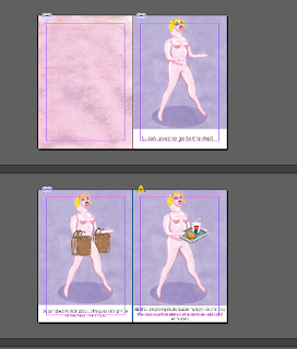
This was my initial idea for the page layout of my book, but when I put it on InDesign I thought it looked too crowded and messy. So I've had to expand my book from a 12 page to a 20 page, which sounds like a huge jump but it's just more spread out. So instead of having text squeezed in at the bottom, it will be nicely spaced out next to the image. I think it'll look better as a double page spread too, with the full illustration and then the white background with text, the contrast will work together nicely.
Now I just need to work out what I want to say then the book will be complete! Hopefully I will be able to go to drop in next week and get it printed off before Christmas so I can relax a little.

No comments:
Post a Comment